Holly Lanes Bowling Center
Client Goals:
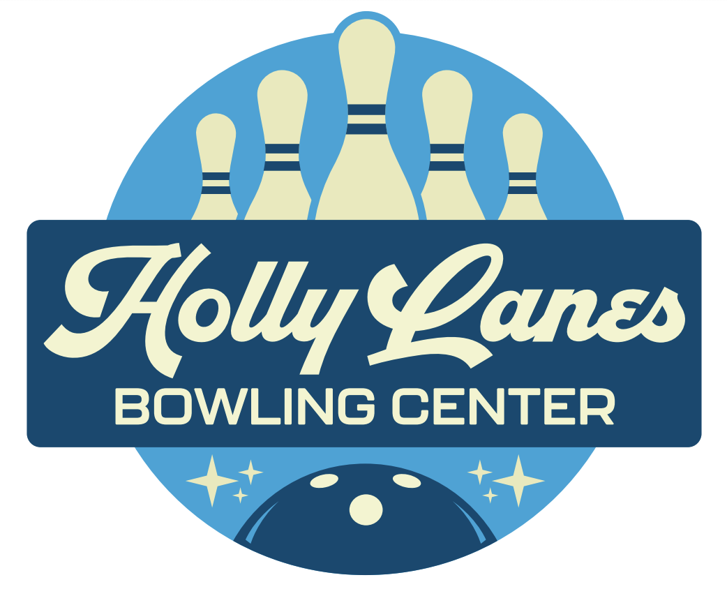
Client’s logo was a bit outdated, pixelated, and hard to read. Needed an overhaul.
Execution:
I wasn’t given much guidance on this one, but I knew what needed improvement. For this logo I went with a classic, vintage bowling vibe. It’s colorful, loud, family friendly and fun while also giving it the feel of being an established business. The client absolutely loved this take and approved it immediately!
CATEGORIES:
Entertainment | Recreation
