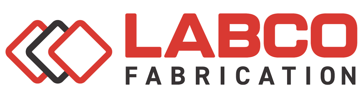
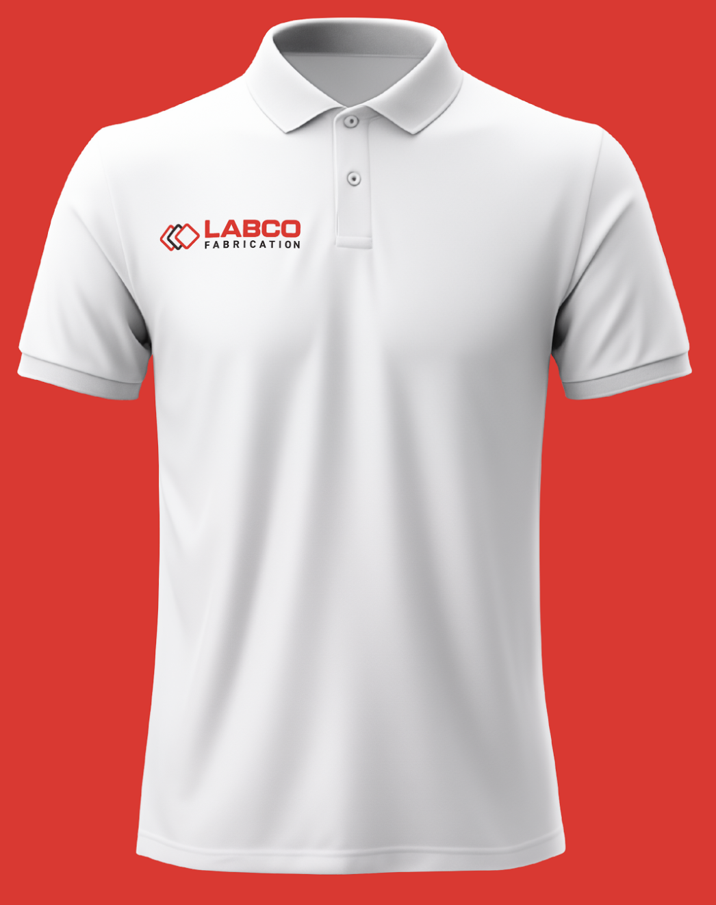
Labco Fabrication
Client Goals:
Revamp of the logo for a fabrication company under new ownership. Embracing a modern aesthetic, while paying homage to the company’s core identity.
Execution:
The redesigned logo seamlessly blends innovation with the essence of fabrication. The dynamic lines and contemporary font convey a fresh perspective, reflecting the forward-thinking approach of the new owner. The incorporation of the interlocking symbols adds a touch of industrial sophistication. The logo subtly evokes the precision and craftsmanship synonymous with fabrication through its use of a bold, sans serif type as well as its sleek and purposeful design elements. By reimagining the original logo, the new owner has left an indelible mark, personalizing it to align with the evolving vision of the company. This emblem not only signifies a change in ownership but also signifies a commitment to progress and excellence in the field of fabrication.
CATEGORIES:
Logo | Manufacturers
TAGS:
Have you seen this…
McMasters Home Gallery SeeSaw
Kelly & Compton PC