Shear Perfections Academy
Client Goals:
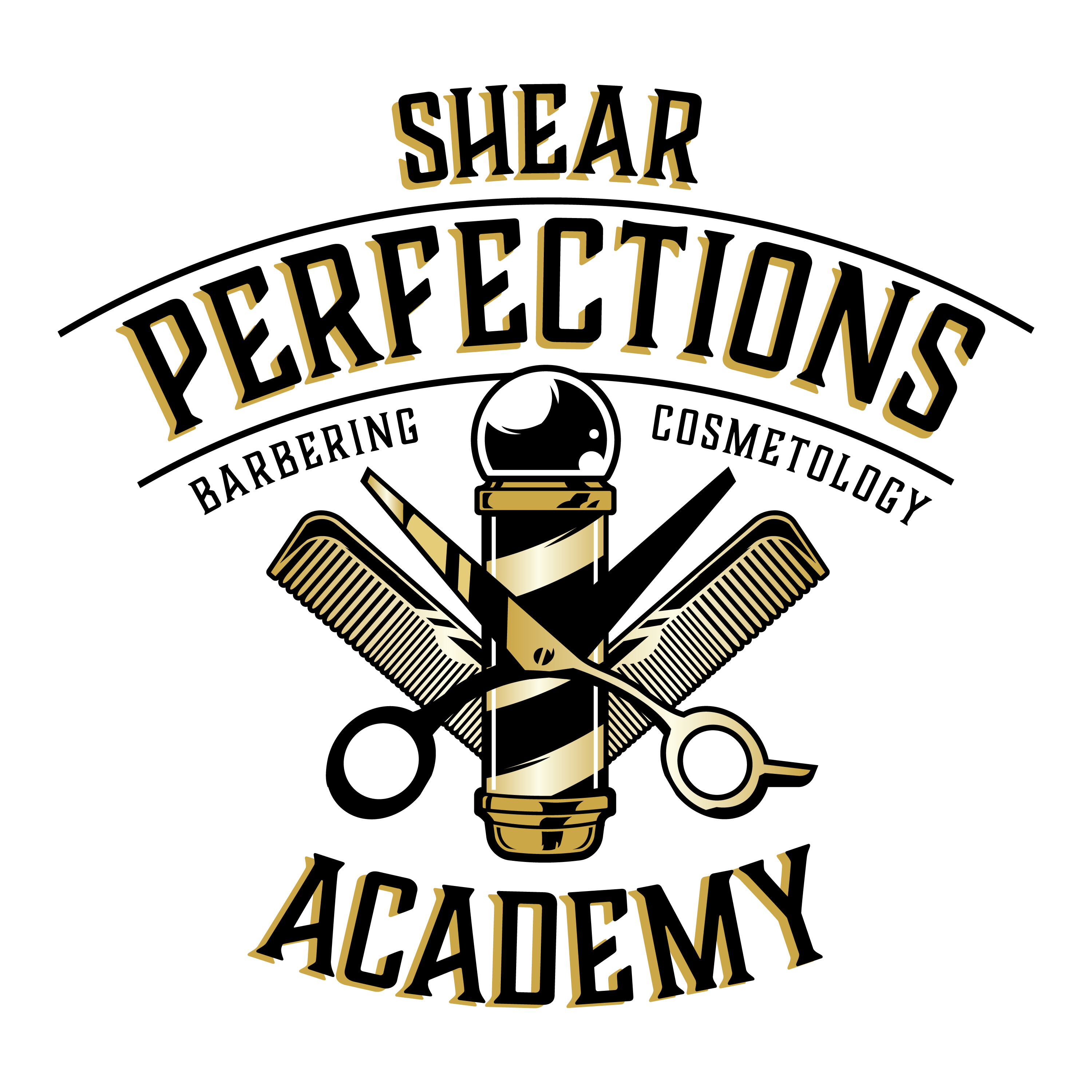
This client’s business was going through changes and needed a new logo. Their old logo was black and gold and featured a woman in a feminine art style. They wanted the new logo to be more neutral, encouraging male customers to come in for haircuts too. Their goal was to create something that felt classic, like an early 1900’s barber shop.
Execution:
This was a tough one, but a fun challenge in the end. I experimented with a lot of old-timey art styles and ornate details, but kept the black and gold throughout. Eventually we decided on a design that would be hard to miss using shiny gold gradients, bold old fashioned lettering, and clean crisp illustrations of various haircutting equipment.
